Information
Architecture
of a wine website
I was tasked with creating the information architecture for a wine website that educates and facilitates purchasing wine. This included devising schemes to support organization, labeling, and navigation within the digital information environment.
Why
This project delves into creating structure from chaos. After weeks of qualitative research, I was able to create the information architecture for a website that educates wine consumers and allows them to purchase wines. The final product is a collection of medium-fidelity wireframes.
What
I conducted domain expert interviews to inform the creation of domain models and sitemaps. User journeys illustrated interaction paths and lo-fi wireframes communicated content and organization. Card sorts, tree tests, and click tests were implemented to refine and test figures.
How
Process
Assessing the competition
I began by conducting informal audits of various online wine shops and enthusiasts’ websites such as Vivino and Virgin Wines to gauge what kind of information wine websites provide users with. I noticed that most websites either focus on educating consumers about wine or selling wine, but rarely both.
Findings: There may be a benefit in creating a platform that offers information about wine and provides the opportunity to shop for wine, so users can put that information into practice.
in lieu of being an expert, i chatted with a few
I spoke with three wine experts who shared their knowledge of wine production, consumption, and selection.
Findings: The interviews highlighted the gap in knowledge between regular consumers and experts, the connection between wine & food, and the art of tasting & describing wine. I allowed these concepts to shape my domain model.
Domain Modelling
My goal was to provide information to consumers in a simple and digestible way and understood that my domain model needed to reflect that desire. The model served as an essential point of reference for all diagrams I created moving forward so it needed to be informative but also straightforward. Color and size were used to differentiate hierarchies of entities. The occasional grey backdrop was also used to group and highlight relationships between entities without creating extra unnecessary visual noise.
Card Sorting
To determine the most useful way to structure my sitemap, I conducted an open card sort with 10 participants. The card sort results helped me understand what terms users related to each other, and from there, I was able to create function groups with a common purpose.
Findings: There were multiple terms that participants were not familiar with which prompted me to include a section/glossary for Wine Terms
Tree Testing
Next, I conducted a tree test with the same 10 participants to determine if my global navigation labels; “Wine Basics”, “Drinking Wine”, “Food & Wine Pairings” and “Shop” would accurately lead users to the information they were seeking.
Findings: This test revealed that the label “Shop” created confusion among users, as they assumed it would contain information about how to shop for wine rather than be an online store. I changed the label to “Wine Shop” for clarity.
Sitemap
The final sitemap focuses on top-navigation, sub-navigation, and tertiary navigation levels. I included filtered facets that help users reach more granular levels within the content-heavy sections of the site.
User Journeys
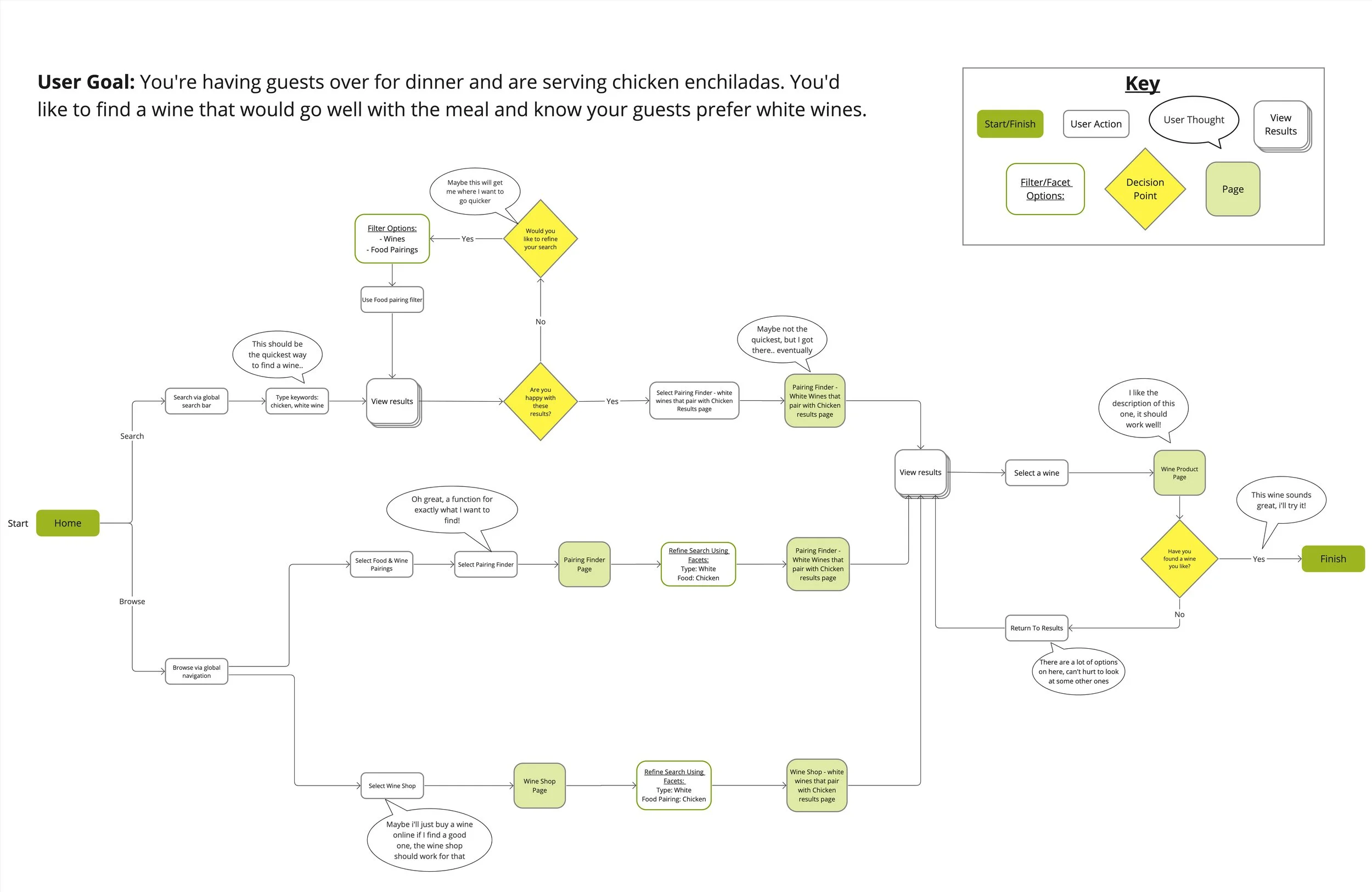
The user journey walks through the process of finding a wine to pair with a meal. During tree testing, many participants accomplished this goal by using global navigation to reach the “Food & Wine Pairing” page, which is the ideal route for a user who knows exactly what they’re looking for. To provide another route that encourages discoverability, I modified the search function in the global navigation to include filter options, including search for “Wines” and “Food Pairings” to ensure a user is able to reach the “Food & Wine Pairings Page” by searching keywords such as “chicken” or “chicken and wine pairing”.
Wireframes
I chose to wireframe 4 pages that were different enough to showcase the range of what this website offers but also would logically work together for evaluating users’ ability to move from one page to another during testing tasks. After wireframing I conducted a combination of moderated and unmoderated first-click tests, 5-second tests, and asked users to complete various tasks while talking through their reasoning.
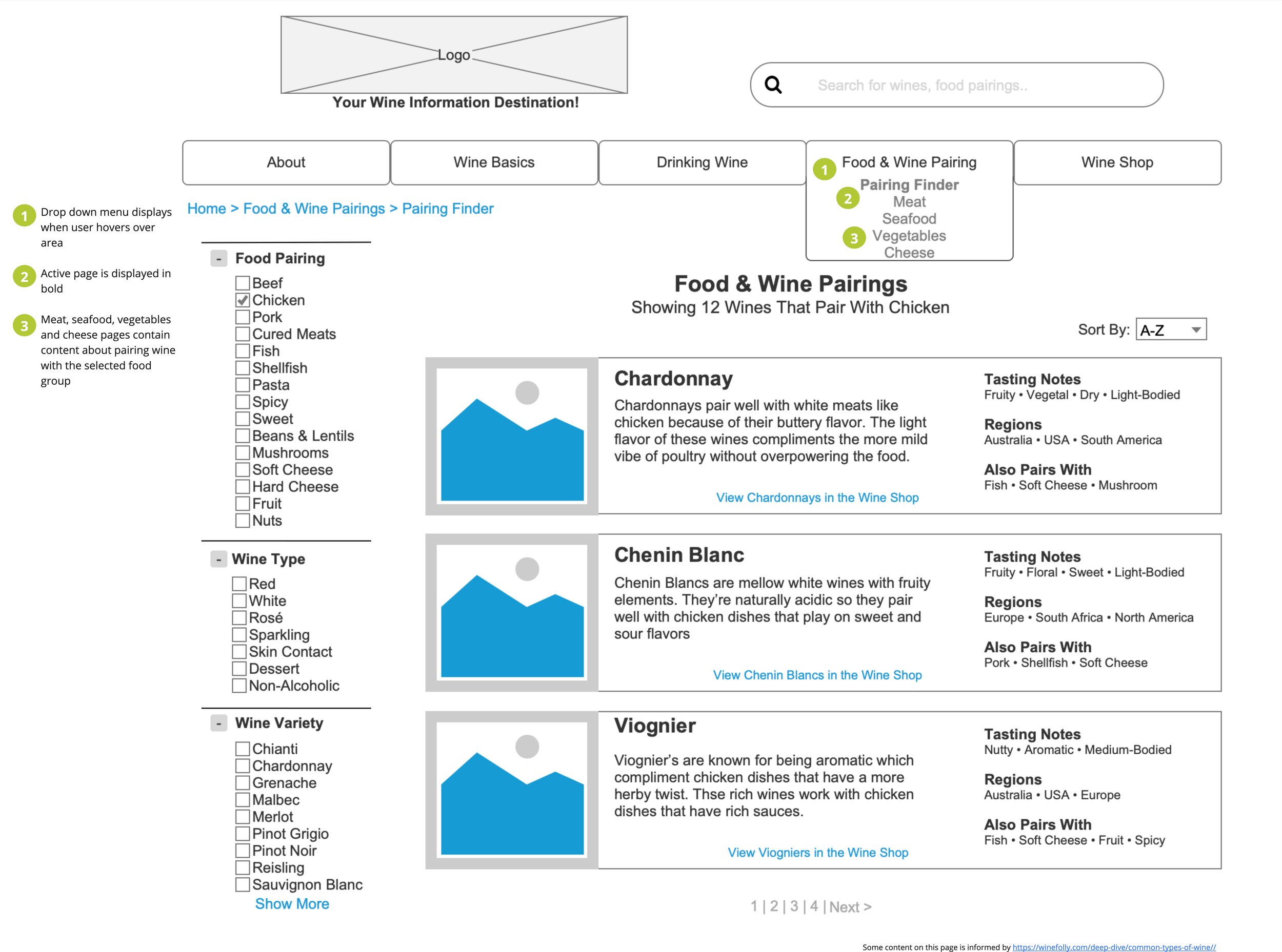
Wireframe 1 - Food & Wine Pairing Finder Page
Keeping in mind that users would likely arrive on this page from an external search engine, I wireframed the Food & Wine Pairing Page first. Breadcrumbs were incorporated below the global navigation to help users understand their current location within the site.
Future Iterations: During testing, a user pointed out that there are a lot of options in the filter sections, and it would be easier if she could search for exactly what filter she wanted to use. In future iterations of this page, I would include a search function for filters with more than 7 options to help users accomplish their goals quickly.
Wireframe 2 - How To Store Wine Page
This page explores useful information that a wine consumer may be interested in and provides an opportunity to educate site visitors.
Future Iterations: I’ll explore combining the “Wine Basics” and “Drinking Wine” sections into one page to reduce confusion or testing more descriptive page labels to help users better predict what kind of content lives in each section.
Wireframe 3 - Wine Shop Page
This page uses faceted navigation to help users better understand what’s available to them and how to search for it. I included seven facet topics for filtering results but understood that users may find that amount distracting. I included a minus button function to hide facet topics to reduce the amount of options displayed.
Future Iterations: During testing, one participant pointed out that there is no option to remove all selected facets options, I would add a remove all function to make it easier for users to return to a neutral page.
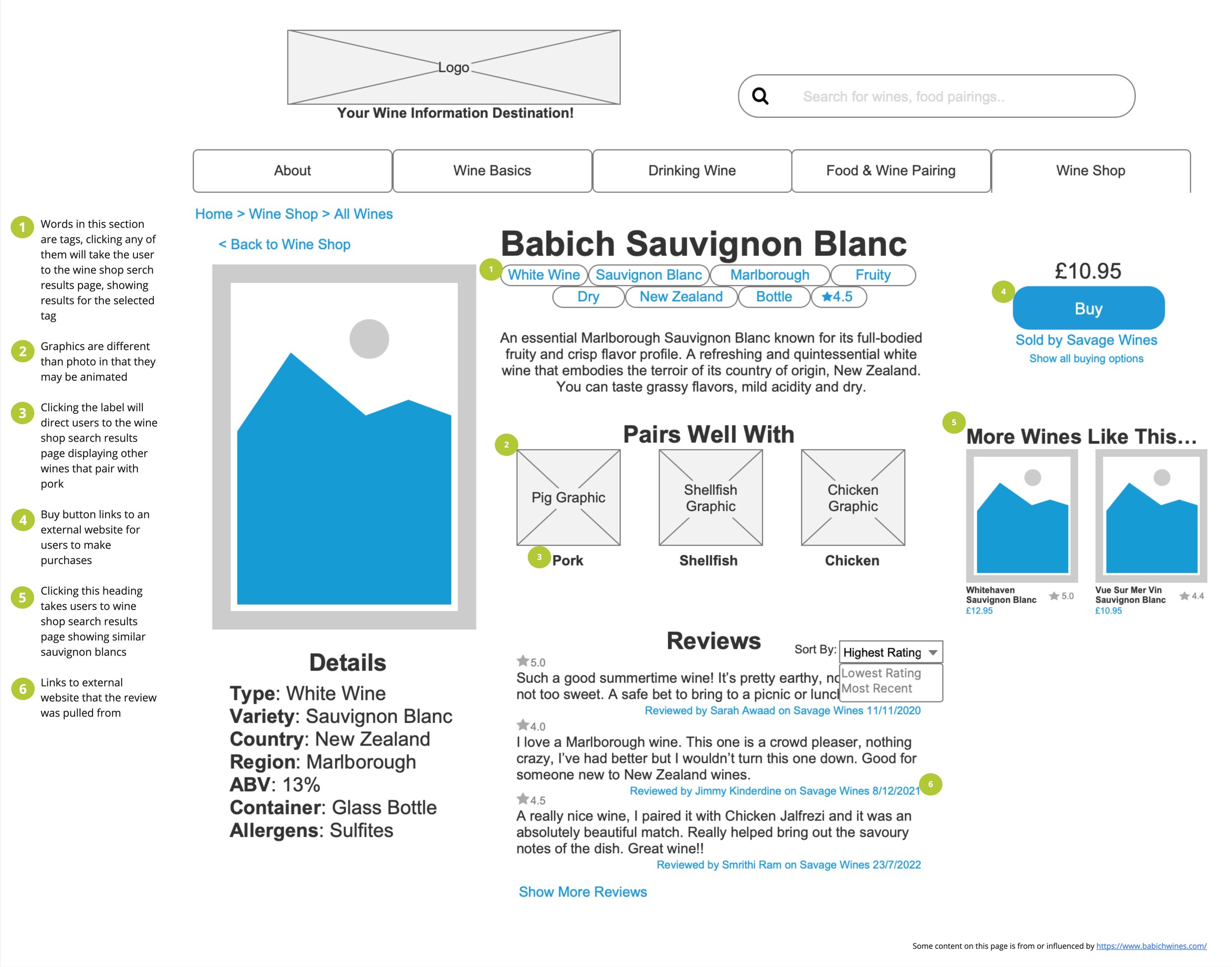
Wireframe 4 - Wine Shop Product Page
This page is essential in giving users an opportunity to use the knowledge they may have acquired from other parts of this website. Learning about wine is important but being able to effectively use that knowledge to select a wine is a goal I wanted users to be able to accomplish. This site does not sell wines but does direct users to external websites where they can purchase a selected wine.
Future Iterations: During testing one user also assumed that the “More Wines Like This..” area would take them to an external page. To ensure users understood that that section links internally, I would move it to a different area of the page away from the buy button to reduce confusion.
Reflection
This project was successful in producing a first version of the information architecture for a wine website based on evidence and data. More iterations will need to be done to refine the website, but these wireframes serve as a great foundation to build from.


